
Starting this month we will be introducing a series of guest blogs on other aspects of British cinema and colour. We’re delighted to open this series with a piece from our colleague and friend Dr Richard Farmer, who worked on the recent 1960s British cinema project (@1960sProject).
As Britain became more affluent during the 1950s, ever larger sums of money were spent on advertising. This resulted in the increased visibility of advertising in British popular culture, and an increase in the range of media through which advertisements reached the public. Most notably, the arrival of ITV in September 1955 brought moving-image advertising onto British televisions and into British homes – although the effectiveness of some early commercials was undermined by a tendency towards long takes, slow pacing and explicatory commentary, as in this example from 1955:
However, although television was extraordinarily appealing to advertisers, ITV broadcast in black and white until late 1969, and even after that colour TV sets remained in the minority for several years. This meant that until at least the end of the 1960s – and in reality well into the 1970s – if advertisers hoped to combine moving images with colour they needed to do so on the cinema screen. Indeed, the cinema offered advertisers a unique combination of technologies, with cinema advertising company Pearl & Dean boasting that ‘The cinema is the only mass medium which gives sight, sound, movement and colour.’
Colour was of great interest to advertisers. Although posters and magazines had offered colour for decades, and colour cinema advertising can be traced back at least as far as the late 1940s, the birth of the consumer society brought about an increase in the amount of colour advertising in the United Kingdom. The introduction of the Sunday Times Colour Supplement in February 1962 (followed by similar magazines in the Observer and the Telegraph a couple of years later) and greater amounts of colour advertising in newspapers were both part of a wider trend.
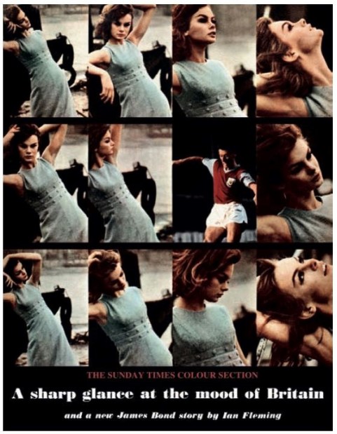
The cover of the first edition of the Sunday Times Colour Section, 4 February 1962 (featuring Jean Shrimpton and Jimmy McIlroy)
By 1966, almost half of the advertising in consumer magazines, and more than a third of advertising in the trade press, was estimated to be in colour.[1] The cinema was ideally placed to take advantage of this greater prevalence of colour in advertising, with colour advertising films contrasting both with monochrome television commercials, and also with other elements of the cinema programme: it was only during the second half of the 1960s that more British feature films were made in colour than in black and white.
Colour was thought a useful tool in advertising products seeking market share in highly competitive retail sectors. Brightly coloured packaging was often used to help the consumer distinguish between similar products on crowded shelves; using colour film to advertise allowed for better pack recognition, and was held to increase the chance of a sale, as it improved recall of the look of a brand, not simply its name.[2] Colour also helped an advertising film stand out, and in 1961 research conducted in the USA found that consumers were 50 per cent more likely to want to buy a product if it was advertised in colour.[3] Colour was held to make advertising films more arresting, more memorable, and more effective, and was especially suited to the promotion of products whose appeal lay, at least in part, in colour, offering the possibility of life-like representations whilst simultaneously taking advantage of the glamour offered by colour and the cinema as a site of experiential pleasure.
The latest fashions were also obvious candidates to benefit from colour advertising. In 1971, Lulu was employed to advertise manufacturer Joyce’s ‘Happy Shoes’ and ‘Happy Boots’. Alongside the catchy, upbeat soundtrack, written by Lulu and her then husband Maurice Gibb, colour is central to the way in which the film works. Whilst contributing to the sense of fun, and energy and exuberance that the film communicates, the choice to shoot in colour allowed the film to show off the wide range of hues in which these products were available: the dissolves between the different coloured boots, for example, would be rendered largely ineffective if shown in monochrome.
However, for all that the chance to use colour made advertising in cinemas an attractive proposition, the demographic make-up of the audience was probably a bigger factor in persuading advertisers to dedicate large sums to exhibiting promotional films in cinemas. By the 1960s, cinemagoers were increasingly and disproportionately youthful, and as younger Britons were the group that had probably benefitted the most from increased affluence, advertisers were especially keen to reach them.
The Midland bank, working with the Cammell, Hudson and Brownjohn agency, made a beeline for the cinema when it sought to make its pitch for the business of the more youthful market, but once there availed itself of the technologies that the cinema could offer. Here, colour was of secondary concern in the development of the campaign, facilitated by, but not necessarily influential on, the decision to use the cinema as the primary medium by which to reach potential customers.
The Midland took to the decision to make the banking sector seem less conservative and more accessible to the younger consumer. Humour was the main means by which this was done and the playful and innovative use of typography – the work of Robert Brownjohn – was underscored by the use of colour, which is perfectly judged. Colour is used subtly, at the service of the message, not as its focus; the change from orange to yellow of the word ‘morning’ – the ‘o’ in which rises like the sun – or the decision to use white for the word ‘jet’ – the downstroke of that word’s ‘T’ left on the screen like a vapour trail, or the red lettering of the word ‘bus’, that spoke to the colour of that form of transport in the capital.
By the time that ITV began broadcasting colour commercials, the majority of cinema advertising films had already switched over to colour. Colour could still be used in visually and thematically arresting ways, but its normalisation within the film industry – and increasingly in television advertising – meant that the choice became not when it might be appropriate to use colour film stock, but when it was the correct choice to use black and white. As the use of colour film became the norm, the cinema was less able to use it as a selling point, but it could still use it in combination with other technologies – loud, clear sound; big, clear pictures – to sell products to specific groups. The continued presence of advertising films in cinema programmes today suggests that colour was not the sine qua non of cinema advertising, and might encourage us to recognise that when we discuss the importance and appeal of colour, we should be careful to understand its relative importance in comparison with a host of other technologies and commercial factors.
[1] Television Mail, 9 December 1966, p. 11.
[2] Television Mail Supplement, 24 June 1960, p. 5.
[3] Television Mail, 14 April 1961, p. 71.
Biography
Dr Richard Farmer is Lecturer in Film & Media Studies at the University of East Anglia, and was previously Research Associate on the AHRC-funded “Transformation and Tradition in Sixties British Cinema” project. He has published widely on British cinema and leisure culture – his recent article on the Sea Witch ‘Lost Island’ colour cinema advertisement can be accessed for free here: http://www.tandfonline.com/doi/full/10.1080/01439685.2015.1129709.
