by Dr Liz Watkins. University of Leeds (e.i.watkins@leeds.ac.uk)
From the vibrant hue of a detail that punctuates the image to a single colour that envelopes the screen, the chromatic, in films by Nicolas Roeg, signals a greater acuity than cosmetic distraction. In Roeg’s work I would find both an attention to a central paradox of cinema – a photographic inscription of an image by light as permanent record of a fleeting moment – and an experimental approach to photography and editing that has frequently been described as fragmented and labyrinthine (Roeg 2013, p.5, p.29; Houston 1973, p.205). However, my initial textual analysis of Don’t Look Now, found that the colour red demanded an attention to the materiality of the film. Colours fade and colour balances shift: cyan and yellow dyes diminish emphasising the red hues. In viewing a 1973 Eastmancolor circulation print it seemed that the degradation of the image underscored the effects of lens flare as an element of film style (Watkins 2015). What I want to suggest is that Roeg’s approach to colour combines a fascination with photographic materials and effects, filmmaking practices honed through his work as cinematographer for directors including Roger Corman, François Truffaut, and Donald Cammell, and experimentation with the possibilities of different colour technologies, lighting and editing. From a stated interest in the ‘retained image’, which Roeg describes as much like the indexicality of the photographic (associated with Bazin’s concept of the death mask), to the complexity of a film form structured through layered flashbacks, Roeg’s work examines the disquieting of belief systems and social structures.
The thread that can be tracked through the labyrinthine form of Roeg’s film work – social order and its enactment – is underscored by a tension in the organisation of colour, as it shifts between the lighting and design of classic cinema (bright reds, yellows set forth against greys and browns, else contrasting hues) and a spontaneity of camera movement and naturalistic lighting. For example, Roeg has cited classic Technicolor designs (c.1940-1950) as an influence for his cinematography on The Masque of the Red Death (Corman, 1964) and Fahrenheit 451 (Truffaut, 1966). In The Masque of the Red Death the progression of colour rooms (blue, purple, green, orange, white, violet), drawn from Edgar Allen Poe’s text, is interspersed with a vibrant red hue as something that spills and consumes from within. A thread of colour can be tracked throughout the film, from the plague of the Red Death outside the castle, to the fantasies that consume from within it (Branigan 2017, p.121): its meaning lies in its movement. For Fahrenheit 451, shot on Eastman Color, Roeg recalls Truffaut’s request for the ‘artificial and glossy’ colour schemes associated with the studio lighting of three-strip Technicolor (Petrie 1996, p.136). The film contrasts colour details – red fire engines – with a background of naturalistic hues. Roeg’s references to Technicolor design are interlaced with a broader cultural shift in the visual style of 1960s filmmaking. As Duncan Petrie has written in his essay on British Cinematography, the 1960s saw a transformation from ‘hard-edged, high-contrast lighting to a softer, more diffused use of illumination; from carefully composed images and minimal camera movement to a much freer, more mobile and spontaneous visual register; from the aesthetics of classicism to a much more self-conscious use of form appropriate to a decade associated with a new emphasis on spectacle and sensation’ (Petrie 2018: p.204). Petrie’s argument, that the availability new lenses and increased light sensitivity of film stocks facilitated ‘a new topography and environment’ (Petrie, p.210) links film technologies and aesthetics with a decade characterised by social and political change. However, I want to suggest that Roeg’s collaborations with cinematographer Anthony Richmond further erode the dominant teleological form of a film history that has been determined by technological innovations (see Elsaesser’s critique, 2016) and concepts of authorship.
Roeg’s work with Richmond – Walkabout (1970/1971), Don’t Look Now (1973), The Man Who Fell to Earth (1976) and Bad Timing (1980) – combines naturalistic colour with photography considered experimental to commercial cinema: inverse images, slow motion, and mirrors extend and complicate the filmed space to convey dystopian landscapes.[1] Each of these films utilises lens flare, and shots which ‘fall away into underexposure on the actors in the background’ concealing the peripheral areas of the image. Richmond has linked these characteristics in Don’t Look Now to the increased sensitivity of film stock (Richmond 1976; Watkins 2015). The effects of lens flare – causing the overexposure of the film as the light refracts on the camera lens and effaces the legible composition of the image – persists as the filmic expression of disorientation, intoxication and cultural displacement in contemporary works – Picnic at Hanging Rock (1975) and The Last Wave (1976) – shot by Russell Boyd for director Peter Weir. Boyd combines time-lapse sequences of dark clouds, backlit with golden sun and reflected in the windows of a skyscraper (The Last Wave) and slow-motion, high angle and 360˚shots in Picnic at Hanging Rock. The diminished hues of each overexposed image disquiets otherwise familiar landscapes. The entanglement of film technologies and aesthetics testifies to the persistence of filmmaking practices beyond the perceived obsolescence of a colour process such as three-strip Technicolor and questions the borderlines of national cinemas.[2]
The selection of film stock was significant to colour design of Performance (1970), a film which Roeg co-directed with Donald Cammell. As cinematographer, Roeg used several film stocks, which were later edited into a non-linear, elliptical narrative, underscore the depiction of ‘two distinct worlds – the sharp, urbane realm of the British gangsters and the soft multicolored psychedelics of Turner’s townhouse’ (Sweeney 2007, p.16). This apparently unwieldly chromatic design traces the tension and violence of ‘identities within the narrative, [as] they constantly clash and then finally merge.’ (Sweeney 2007, p.16). The colour design initially seems familiar to classic Technicolor, yet then shifts to a black and white 16mm shot of the same scene.


Performance (Donald Cammell and Nicolas Roeg, 1970). DoP. Roeg. black and white and Technicolor (UK). Technicolor lab. The interior of the office conforms to classic three-strip Technicolor design. The sequence then shifts to black and white 16mm shot of the same filmed space.
The subsequent use of colour lighting obfuscates the architectural details of the image evoking the myriad threads and opacities of social groups and their elisions (the lonely, lost, displaced and grieving).

Performance (Donald Cammell and Nicolas Roeg, 1970). DoP. Roeg. Colour lighting obfuscates the legibility of onscreen space.
The combination of colour registers – naturalistic and kaleidoscopic effects of overexposure and the use of superimposition – persists in The Man Who Fell To Earth (1976).

The Man Who Fell to Earth (Dir. Roeg 1976) DoP. Anthony Richmond. Color/ laboratory Technicolor UK. The film includes a line of dialogue that later formed the title of Roeg’s biography “a view of a world that is ever changing, like our solar system”.
The Man Who Fell to Earth addresses both the corporate aspects of film (Eastman Kodak, RCA) and institutional uses of audio and visual experimentation (scientific, medical enquiry) through which the artifice of natural colour emerges as paradigm of misperception.
In turn, the non-linear narrative of Walkabout (1970/71) cross-cuts between scenes and sequences played in reverse and interlaces several narratives. The film follows two children who are lost after their father’s suicide in the Australian outback. The desert becomes labyrinthine – indecipherable – for the lack of familiar cultural referents – until their path intersects with an Aborigine (David Gulpilil) on Walkabout. The photographic expression of physiological and cognitive disorientation utilises lens flare to erode the legibility of the film image emphasising the disorientation of children dislocated from the familiarity of the city.

Walkabout (Nicolas Roeg, 1971). Images from 2000 DVD release. Cinematography Roeg and Anthony Richmond. A close-up of the boy (Luc Roeg) as his eyes close, is followed by a shot in which the screen is enveloped by the colour red, then lens flare. In the final shot the legible architectural detail of the image is effaced by the over exposure of the image as his senses – physiological and cognitive – are overwhelmed by the heat and light of the environment.
The girl’s desire for a return to civilisation, a concept that manifests as an abandoned house, is further disabused in the suicide of the Aborigine: social order is enacted as miscommunication: a world marked by opacity, in which meanings emerge between narratives and the fragmented form of the film (Lapsley 2009, p. 23).
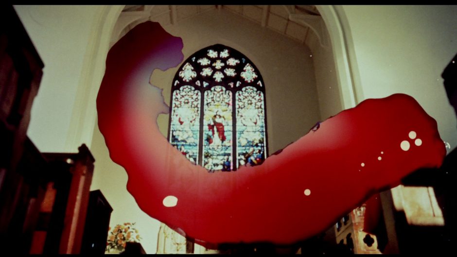
To return, briefly, to Don’t Look Now, the repetition the colour red is interlaced with gesture. Mirrors, lantern slides, magnifying glasses complicate onscreen space, whilst locations are revisited and images recur to form threads of connections throughout the film. Meaning is liminal, it does not reside in a solitary colour or concept, but is transient to a thread of connections across films, materials, practices, and subjective perceptions.


Don’t Look Now (Nicolas Roeg, 1973). DoP. Anthony Richmond. Studio Canal 2006 DVD release. The colour red and shots recur throughout the film. The inverse image of the child, her red coat reflected in water is prescient of the shot of her father’s murderer in Venice.


Don’t Look Now (Nicolas Roeg, 1973). DoP. Anthony Richmond. Studio Canal 2006 DVD release. The repetition of gestures, like colours and the recurrence of specific shots, connects characters, locations, events.

Don’t Look Now (Nicolas Roeg, 1973). DoP. Anthony Richmond. Studio Canal 2006 DVD release. Mirrors extend and complicate onscreen space, emphasizing a theme of visual enquiry and the veracity of perception.
_ _
[1] For example, the scholar Peter Cowie notes the use slow-motion to depict John Baxter’s response to the death of daughter Christine in the opening sequence, as an editing technique associated with violence in films contemporary to the release of Don’t Look Now (1973, p.8).
[2] For Elsaesser the concept of obsolescence indicates a technology that is no longer part of the dominant system of economic circulation, although the use and influence of colour processes, which in the example of Roeg’s filmmaking is three-strip Technicolor design, persists.
Filmography
Nicolas Roeg as Director of Photography. Selected works:
The Masque of the Red Death (Roger Corman, 1964) Cinemascope, Pathecolor.
Nothing but the Best (Clive Donner, 1964) DoP Roeg. Eastmancolor
Fahrenheit 451 (François Truffaut, 1966) DoP Roeg. Eastmancolor.
Petulia (Richard Lester 1968) DoP Roeg. Color Technicolor.
Far From the Madding Crowd (John Schlesinger, 1967) DoP Roeg. Metrocolor (35mm Eastman 50T 5251) (70mm)
Performance (Dir. Donald Cammell and Nicolas Roeg, 1970). DoP. Nicolas Roeg. black and white and Technicolor (UK). Technicolor lab). Editors: Gibbs, Brian Smedley-Aston, Frank Mazzola, Tony Palmer.
Anthony Richmond (DoP) prior to his work with Roeg.
One Plus One /Sympathy with the Devil (Jean Luc Godard 1968). DoP. Richmond. Color. Eastmancolor 35mm.
Nicolas Roeg (Director) and Anthony Richmond (DoP):
Walkabout (Dir. Roeg 1971; Special Photography Anthony Richmond) Editor Brian Mann. Eastman Colour.
Don’t Look Now (Dir. Roeg 1973), DoP. Anthony Richmond. Editor Graeme Clifford. Negative format 35mm (Eastman 100T 5254).
The Man Who Fell to Earth (Dir. Roeg 1976) DoP. Anthony Richmond. Editor Graeme Clifford. Color/ laboratory Technicolor UK.
Bad Timing (Dir. Roeg 1980) DoP. Anthony Richmond. Editor Tony Lawson. Rank Film Lab Denham. Technovision camera and lenses.
Heart of Darkness (Roeg, US., 1994). DoP. Anthony Richmond. Production for Television.
Russell Boyd as DoP.
Picnic at Hanging Rock (Dir. Peter Weir, 1975)
The Last Wave (Dir. Peter Weir 1977)
References.
Barthes, Roland. Camera Lucida (London: Vintage Books 1996), p.73.
Bicat, Z. and Salt, B. ‘Director of Photography: Anthony Richmond’, in Making Pictures: A Century of European Cinematography (New York: IMAGO, 2003), pp.320–21.
Branigan, Edward. Tracking Color in Cinema and Art, Philosophy and Aesthetics (Routledge: New York, 2017).
Cowie, Peter. ‘Don’t Look Now’, Film in Focus, 16 (1973), pp.8- 10.
Elsaesser, Thomas. Film History as Media Archaeology: Tracking Digital Cinema (Amsterdam University Press, 2016).
Houston, Penelope, ‘Don’t Look Now’, Monthly Film Bulletin, 40, 476 (1973), p.205.
Lapsley, Rob. ‘Cinema, the Impossible, and a Psychoanalysis to Come’, Screen 50:1 (2009) pp.14-24.
Petrie, Duncan. ‘A Changing Visual Landscape: British Cinematography in the 1960s’, Journal of British Cinema and Television 15, 2 (2018), pp.204-227.
Petrie, Duncan. The British Cinematographer (British Film Institute, 1996).
Richmond, Anthony. ‘The cameraman –Tony Richmond’ Screen International 29 (1976), p.14.
Roeg, Nicolas. The World is Ever Changing (Faber and Faber: London 2013).
Sweeney, Kenneth. ‘Review- DVD of Performance’, American Cinematographer 88, 6 (2007) pp.12, 14, 16.
Watkins, Liz. ‘Don’t Look Now: Transience and Text’, Screen 56, 4 (2015) pp.436-449.
