
In an earlier blog post I commented on the use (or different uses) of the brand ‘Eastman Colour’ within the British film industry, particularly in relation to the dominant brand identity of Technicolor. Since then, additional project research has revealed the legal agreements that Technicolor insisted on that dictated the appearance of the Technicolor brand on film poster advertising (and in film credits) from the 1950s on, even after Technicolor largely moved away from film production into a post-production laboratory role.
The identification of Technicolor in advertising was a source of tension as Eastman Colour was being introduced. In June 1954, Pathé Laboratories brought a legal suit against Technicolor asserting it was ‘“unfair and deceptive” for the Technicolor label to be put on films printed by Technicolor but photographed in the Eastman Color process’. (1) Pathé specifically claimed the public was not able to differentiate between Technicolor processing Eastman negative and Technicolor’s three-strip dye transfer imbibition process, despite there being a clear difference in production techniques and effects.
Although Pathé would ultimately withdraw their suit, Technicolor’s response in the U.S.A. and the U.K. was that its trademark was used ‘to connote that prints of pictures bearing such phrases are products of Technicolor or its related companies”. Indeed, a Technicolor advert published in Kine Weekly (2: reproduced below) thanks the film industry for their cooperation in protecting this trade mark with (occasionally labyrinthine) explanations for when ‘Colour by’ and ‘Prints by’ would be used on advertising.

How does this relate to this blog post specifically? We’ve talked about the project database before in blog posts, but I want to focus on one part of that database: a list of the different colour sales messages used on British film posters from the mid-1950s through the mid-1980s. Given how important Technicolor was in film advertising from the 1930s on, the questions I wanted to ask of that data were: how often is Eastman Colour used in film poster advertising? Does that challenge the dominance of Technicolor? Does the mainstream adoption of colour (around 1969) change how it features within poster messages?
Results
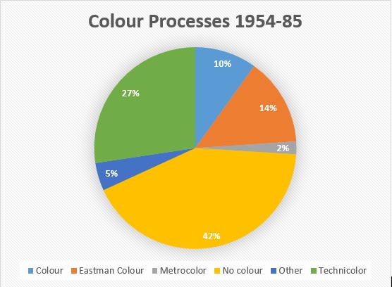
Given the legal situation described above, it is perhaps not surprising to see Technicolor as the largest ‘named’ colour brand (495 films). While Eastman Colour is a distant second (254 films) in terms of a specific brand name, it is also the underpinning yet unnamed process for most of the brands and terms that featured across the rest of those posters: from ‘Colour’ (179 films), Metrocolor (37 films), to the catch-all category of ‘Other’ (e.g. ColumbiaColor, Gevacolor, TruColor, WarnerColor, and one-off promotional processes such as ‘Camelot-Color’ (Siege of the Saxons, 1963), ‘Diabolicolor’ (The Black Torment, 1964), ‘Colour magnificence’ (Knights of the Round Table, 1954) or Lunacolor (First Men in the Moon, 1964).
As Technicolor’s Technical Manager J.R. Houshold explained, such processes ‘were originally photographed on Eastmancolor negative (as 90% of colour films are). Kodak do not patent their color negative hence that if MGM or Warners finance a big budget film then they can call it as they wish’. (3)
Colour as a broad descriptor rather than a specific process/brand can be seen in posters as early as the first British Eastman Colour film, Our Girl Friday (1953), and crops up occasionally through the 1950s. However, from the poster for Tarzan the Magnificent (1960) on, ‘Colour’ begins to appear more frequently, with between 2 and 4 films a year advertising its colour status but not listing a specific process.

One of the most famous examples here is the Carry On… series, which moved into colour with Carry on Cruising (1962). While Cruising, Jack (1964), Cleo (1964), Cowboy (1966) and Screaming (1966) feature ‘Eastman Colour’ on their posters (often in quite small type), from the release of Don’t Lose Your Head (1967), ‘Colour’ became the main description, before the term disappears completely in poster advertising from Carry on Henry (1971) through to the end of the series.
One of the other main comedy franchise of the 1950s and 1960s, the Doctor series, also moved from specific process through generic description in poster advertising: Doctor in the House (1954) was promoted in ‘Technicolor’, as was Doctor at Sea (1956), although the latter is likely to be an example of the Technicolor agreements cited above given it was filmed in VistaVision, which almost exclusively used Eastman Colour stock.


Doctor at Large (1957) was Eastman Colour and VistaVision, Doctor in Love (1960), Doctor in Distress (1963), Doctor in Clover (1966) are in ‘Colour’, while the poster for the final film Doctor in Trouble (1970) – in an echo of the Carry On… examples, features no mention of colour at all.


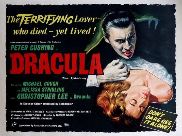
Another popular genre across the time period – the Horror film – prominently displayed colour credentials in film posters: Hammer’s Dracula (1958) is one of very few posters that split the process, with ‘Photographed in Eastman Colour, Prints by Technicolor’. However, the studio had a more flexible approach to colour brands that changed through the 1960s, and which may have been linked to county-specific distribution deals. While some Hammer films such as The Kiss of the Vampire (1963), The Evil of Frankenstein (1964) and Horror of Frankenstein (1970) would use Eastman Colour in UK posters, and Technicolor in the US release posters, the bulk of its UK posters captured in the database used Technicolor (or in some instances, Deluxe, a laboratory closely associated with Technicolor).
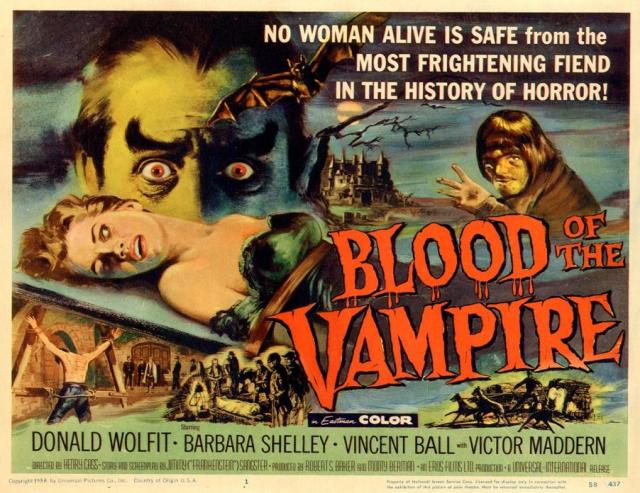
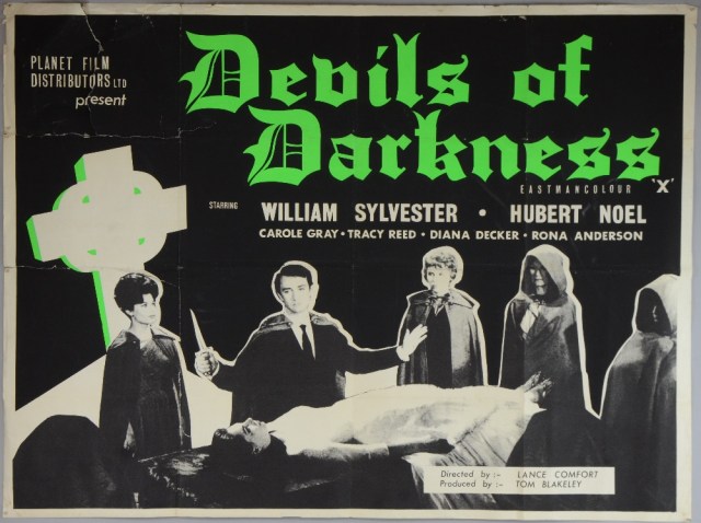
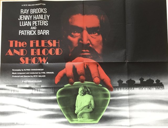
Eastman Colour was the colour brand of choice for lower budget entries from Eros (Blood of the Vampire, 1958), Lynx (Circus of Horrors, 1960), Planet Films (Devils of Darkness, 1965; Island of Terror, 1966), and Tigon (The Blood Beast Terror, 1968; Witchfinder General, 1968; Curse of the Crimson Altar, 1968; The Flesh and Blood Show, 1972).This suggests the Eastman Colour brand retained some cultural (sub-cultural?) and public value, even while other genres may be backing away from using it.
While horror advertising promoted colour processes longer than comedy, there was perhaps a stronger association between the colourful horror of Hammer across this period than ever existed with comedy. Still, in 1967 (mimicking the pattern seen in comedy posters) several horror films opted for ‘Colour’, and by the mid-70s, that was a more common sight on posters than either Technicolor or Eastman Colour.
To look at one final genre, the musical was a mainstay of colour film production since the heyday of American Technicolor in the late 1930s and through the 1950s. In the British context, and across this period, a similar pattern to other genres emerges: from 1954 through 1965, posters identify specific brands, with Technicolor and Eastman Colour dominating. From 1965 through 1980, ‘Colour’ becomes a more regular term in advertising, with Eastman Colour references dropping away and Technicolor remaining, albeit with less status (on the poster) and mainly on bigger budget productions such as Scrooge (1970) and The Slipper and the Rose (1976):


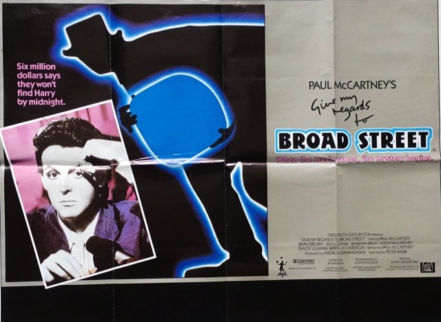
After 1980, colour tends not to appear as a specific sales message in musicals, although there remain some unusual exceptions: Give My Regards to Broad Street (1984), for example, explicitly includes Eastman Colour on its poster (and a reference to Rank Laboratories – but the use of labs on posters is beyond the scope of this post), the first for almost a decade (since 1975’s The Rocky Horror Picture Show).
Across those three genres, and the three decades of the project (1954-85), the ebb and flow of specific branded colour processes on film posters begins to identify a similar, but not identical pattern. Technicolor remains dominant because of legal agreements and contracts; Eastman Colour’s peak remains the decade or so after its introduction, with some genres (horror) more likely to include it than others (comedy); while other processes largely fade away in favour of the more generic ‘Colour’ through the mid-1970s, when colour’s mainstream status removes it as a specific sales message on the bulk of film posters (often replaced by references to newer technologies such as Panavision or Dolby). What the patterns in this data suggests is the shifting sales value of colour processes, and colour more generally, particularly as colour moves from being a spectacular component to an expected convention.
Works Cited
1. Leonard Coulter, ‘Technicolor Dispute’, Kine Weekly 448, 2453 (July 1 1954), p.8.
2. Technicolor advertisement, Kine Weekly 452, 2473 (November 18 1954), p.14.
3. J.R. Houshold [Technicolor Technical Manager] letter to Gordon L. Henry, 11th March 1975.
