
Sarah Street
As colour was incorporated into British cinema during the period covered by our project, films from other countries were occasionally heralded as genuinely offering a new way forward in terms of aesthetic experiment. In this time of lockdown, it is great to see how many colour films are being recommended for another look, bringing welcome reminders of cinematic craft and chromatic richness from the rest of the world into our homes. A recent post by the St. Andrews Centre for Screen Cultures’ series of themed playlists included a number of film choices by Kirsty Dootson, organised around the idea of how particular films highlight specific colours:
https://screenculture.wp.st-andrews.ac.uk/2020/04/30/themed-playlist-rainbow-of-film-colour/
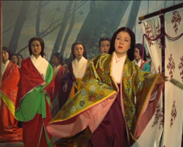
One of her choices is the chromatically stunning Jogokumon/Gate of Hell (Jigokumon, Kinugasa Teinosuke, 1953, shot in Eastmancolor), the first major Japanese colour film to be released outside Japan and widely acclaimed for its colour. From many respects Gate of Hell is a breakthrough film, receiving universal praise from foreign critics, winning major awards at Cannes in 1954 and at the Academy Awards. In 2013 Criterion released Gate of Hell on Blu-ray. It was a transfer of a new digital master created from the 2011 2K restoration undertaken by the National Museum of Modern Art in Tokyo and Kadokawa Shoten Co., Ltd., in cooperation with NHK. In his review, Stephen Prince noted the significance of the scroll painting and graphic arts traditions. He argues that the film is ‘a kind of painting in motion, composed of vibrant gold, green, red, and royal blue hues’. The ‘painting in motion’ can be seen in this slide from early on in the film as sumptuous costumes and figure movement combine in dynamic ways.
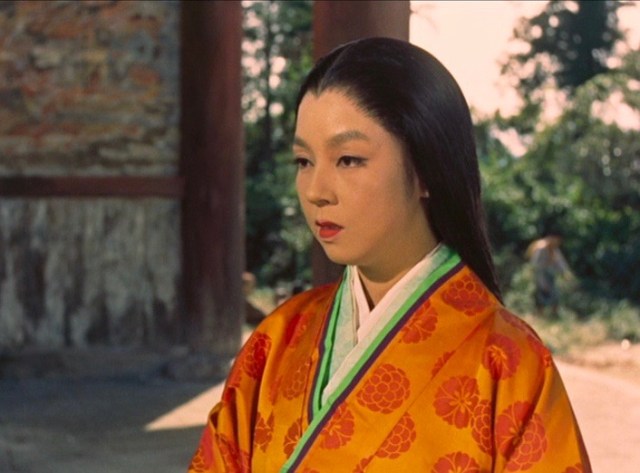
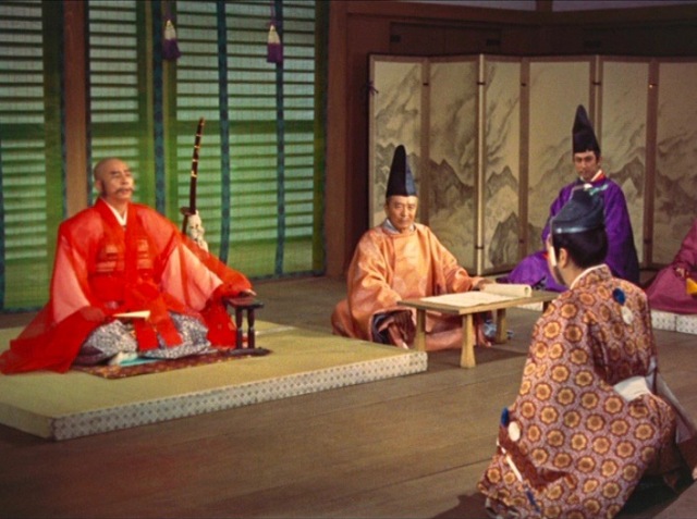
 While I have discussed the film’s key importance in the history of colour film elsewhere (2018), it is notable how opinion was almost uniformly positive amongst critics in Britain, so much so that contemporary British films were often found lacking. In the 1950s Japan was keen for its films to be exported, and colour was a key attraction in achieving this aim. Contemporary reviewers noted that Gate of Hell’s colour was distinctive, for example Arthur Knight in the Saturday Review described it as ‘not only the most handsome picture yet shown on any screen anywhere, but colour plays an important emotional role as well’. He noted how: ‘Fiery-red oranges dominate the opening scenes of chaos in the imperial palace, icy blue bathes the scene of the assassination – and when a soft yellow light breaks into it it suggests both the approaching tragedy and Kesa’s purity…Its delicacy, its subtlety provide an almost startling contrast to our Hollywood-conditioned concepts of colour in films’ (1959). The following slides show how the film uses both ‘fiery oranges’ and the darkness that pervades the film’s later sequences.
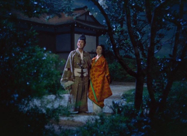
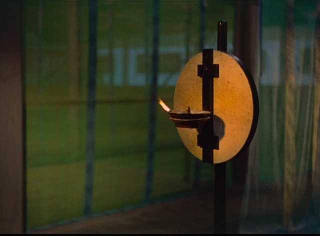
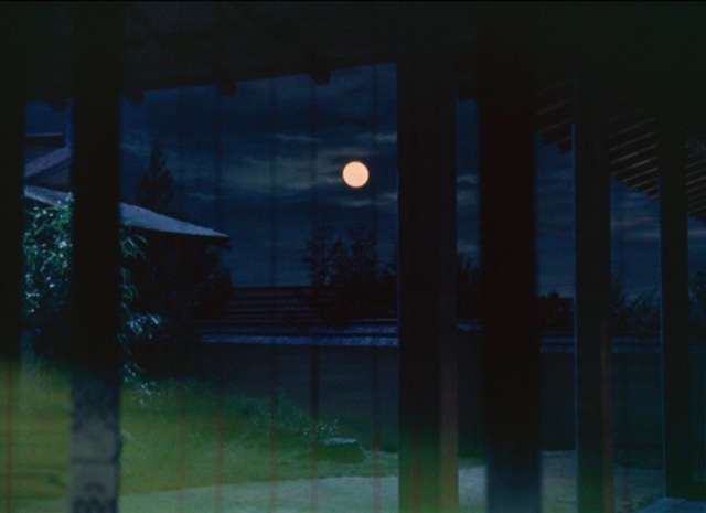
Other reviewers drew attention to particular features of its colour design. The Observer’s critic C. A. Lejeune noted its colour as: ‘The loveliest colour I have ever seen. There is hardly a shot in the film that seems to have been composed haphazardly. Every colour combination has its purpose, and the sense of texture, the changes of tone brought about by the use of gauze materials and translucent screens, the sudden glow or dimming of a lamp, are beauties that have to be seen to be appreciated. 3-D can’t live in the same world with the perspective of this artist’s film’ (Observer, 6 June 1954). Here the film uses light, along with colour, to create particular effects while contributing to the all-pervasive sense of tragedy that underscores the film’s final sequences.
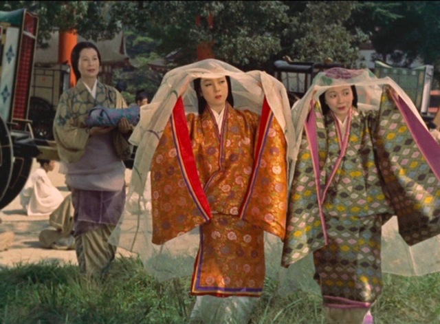
Dilys Powell also noted the quality of texture, particularly for clothes (Sunday Times, 6 June 1954), while another reviewer observed that the director is ‘an artist fascinated by light and shade, colour and texture, movement and contrast. Almost any shot could be taken out of the film and allowed to stand by itself, a perfectly satisfying composition containing all the delicate colour harmonies of a Japanese print. This is not usually a recommendation in the cinema, which is the art of movement, but it is Kinugasa’s achievement that his compositions are pleasing in themselves and yet dramatically effective as they emerge and flow together on the screen’ (The Scotsman, 21 Aug 1954). These images show the costumes, their sumptuous colours and fabrics.
The film was seen as oppositional to Hollywood’s conventions for colour films. Writing in March 1955 in Modern Photography, one American critic asked the question: ‘Does Color Make a Movie?’ ‘Color is unarguably the strength of Gate of Hell; the choice, placement and economy of use of color are sophisticated and artful. Bright colors have been placed sparsely, for a calculated visual effect. Often there are simply one or two bright colors (a red and a purple kimono, for example) set against soft, delicate backgrounds. And if we are shown the elegance of rich oriental costumes, we see one gold-emblazoned role instead of – à la the Hollywood extravaganza – six hundred’. These reviews provide a sense of what was considered to be pleasing, aesthetically distinctive colour. While British directors, as many of our previous blog posts have shown, were also creative in their approach to Eastmancolor, it is worth remembering that these were part of a far more global network of film industries including China, India and Brazil that were also using colour in remarkable ways.
References
Street, S., 2018. The Monopack Revolution, Global Cinema and Jigokumon/Gate of Hell (Kinugasa Teinosuke, 1953). Open Screens, 1(1), p.2. DOI: http://doi.org/10.16995/os.2
