
Conference report by Cathy Lomax (Queen Mary University of London)
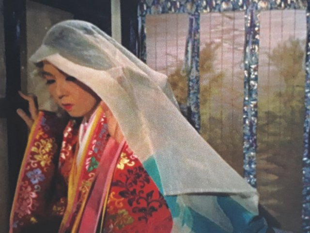 Image: Gate of Hell/ Jigokumon(Teinosuke Kinugasa, 1953, Japan)
The ‘Global Colour and the Moving Image’ conference took place over three sunny summer days at The University of Bristol and featured a dazzling array of perspectives on the theme from a truly global group of contributors. The opening introduction by project PI Sarah Street emphasised the impressive growth in the study of colour since the ‘Colour and the Moving Image’ conference in Bristol ten years earlier, but pointed out that far less is known about colour processes from the second half of the 20thcentury. This conference, hosted by ‘The Eastmancolor Revolution and British Cinema, 1955-1985’ project team, aimed to redress this balance.
The first keynote was from Barbara Flueckiger (University of Zurich) who gave a richly illustrated presentation: ‘Figure / Ground: Relationships of Characters to their Environments in Colour Films’. This included an examination of lighting such as the modelling effects of coloured grazing lights on dark skin tones and mood lighting to illustrate intense emotion. Flueckiger concluded that colour is often overlooked as a tool for expressing subjectivity.
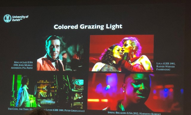 The effects of ‘colour grazing’ on various films as discussed by Barbara Flueckiger (University of Zurich)
The first panel, ‘Intertextuality, Colour Television and Documentary Film’, began with Helen Hughes’ (University of Surrey) paper on the use of Eastmancolor to promote British nuclear power. She noted that the company behind Calder Hall(1955) imported Eastmancolor film stock, which was used to help align atomic power with iconic British imagery (such as red buses). Strategies to boost colour included dipping workers uniforms in yellow so they photographed better, which raised broader ideas on the meanings of yellow, including the (atomic) yellow submarine – famously championed by The Beatles in 1966. The final two papers of the day explored colour television. Elena Gipponi (IULM, Milan) focused on the troubled transition to colour television in Italy, which was delayed until 1977 and was seen as a medium for children, women and queer audiences. She described the pre-1977 marketing of a coloured plastic sheet, which could be used to ‘convert’ black and white screens to colour! Vicky Jackson (University of Bristol) examined the introduction of colour television through the lens of the long-running British soap Coronation Street. Colour heralded some logistical changes including a move away from live recording and the rebuilding of sets. The shift to colour was disparaged by some critics who thought social realism should be in black and white and that colour was unsuitable in portraying the industrial north.
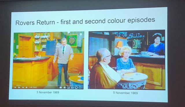 Images from early colour episodes of the British soap institution Coronation Street(1969)
The day concluded with a screening of John Boorman’s 1967 film Point Blankat the Bristol Watershed. The director was unfortunately unable to introduce the film due to ill health but Keith M Johnston (University of East Anglia) stepped in to voice some of Boorman’s thoughts. The conscious colour design of the film, which included an all green office and a yellow telescope, were quite stunning on the big screen.
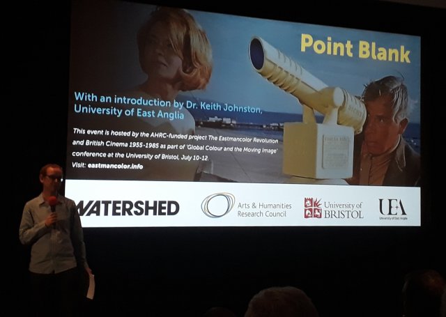 Introduction by project Co-PI Keith M Johnston (University of East Anglia) to Point Blank(John Boorman, 1967) at the Bristol Watershed
Day two of the conference began with a panel on ‘Aesthetic Designs and Colour Contexts’. Frederico Pierotti’s (University of Florence) paper looked at the colour design of Antonioni’s Red Desert(1964), the influence of which can surely be seen in Point Blank. Pierotti noted how the design culture of post-war Italy embraced colour and he went on to unpack the psychological effects of colour coding in industrial contexts. The second paper of the panel was my own investigation into WarnerColor and its impact upon the star image of the young Natalie Wood. This maligned colour process with its unreliable reproduction was teamed with a heavy-handed makeup department at Warner Brothers in the 1950s, with the result that Wood was seen as an over-coloured decorative star rather than a serious actress.
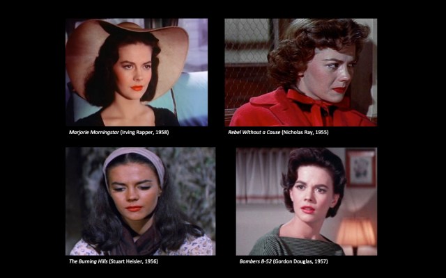 Warnercolor, make-up and Natalie Wood’s changing star image during the 1950s
After a swift coffee break, the next panel considered ‘Colour in Non-mainstream Cinema’. Joshua Yumibe (Michigan State University) focussed on current media trends for nostalgia, and in particular on recreations of 1920s Berlin in the German neo-noir television series Babylon Berlin. He highlighted references to Otto Dix paintings and occasional props of colour, such as a green hat, set against a mostly drab mise en scène. In the next paper, Stuart Moore (University of West of England) examined the retro appeal of Kodachrome to amateur filmmakers, positioning it as ‘the colour of memory’. The final paper of the panel by Bregt Lameris (University of Zurich) discussed how colour’s ability to impact on moods and feelings has often been harnessed as a therapy, for instance in the ‘Auroratone’; a therapeutic device used to treat soldiers during World War Two. Lameris also considered colour and psychological effect in films such as Barbarella (1968),Close Encounters of the Third Kind(1978) and Fahrenheit 451 (1966).
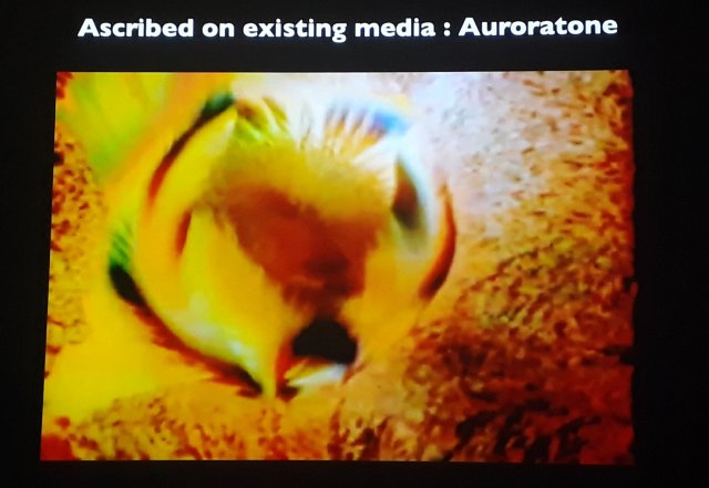 Striking ‘Auroratone’ images used as therapeutic treatment for soldiers during WWII
The following panel after lunch extended the global scope of the conference by looking at ‘Colour Film in Post-war National Contexts’ and in particular the dispersal of different chromogenic stocks around the globe in the post-war period. Kamalika Sanyal’s (KU Leuven, Belgium) paper outlined the use of ‘first’ as a promotional tool for Sweden’s early colour films. She highlighted a number of examples of films given this tagline such as Lappblod (1948), the ‘first Lapland–based colour film’, which was shot in Technicolor and processed in London. And the striking Eldfageln(1952), shot on Gevacolor with some visual similarities to The Red Shoes(1948), which was tagged ‘the first real Swedish colour film’. This was followed by Iryna Morholina’s (Gosfilmofond of Russia) paper, which was packed with information about colour in post-war Soviet cinema. She told us about Soviet filmmakers’ fondness for red, which was often amplified by being shown on screen with complimentary opposite colours. In the third paper of this panel, Josephine Diecke (University of Zurich) examined the competition between Eastman Kodak and Agfa in post-war East Germany. She explained that Filmfabrik Wolfen obtained film stock from the West and analysed it to produce their own film, which in 1964 was exported to India.
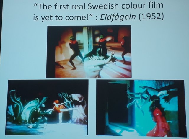 Scenes from ‘thefirst real Swedish colour film’Eldfageln(1952)
The final panel of the day focussed on ‘Historical Colour Film Processes’. The first paper was a fascinating look at fashion films by Lucy Moyse Ferrerira (Central Saint Martins, University of the Arts London), with a particular focus on a film made by artist Sonia Delaunay who was interested in colour and modernity. Delaunay once declared that ‘colour is the skin of the world’ and her beautiful film (which we were shown), was made to illustrate a talk she gave at the Sorbonne in c.1927. Unfortunately, the next speaker, Robert Hoffman, Technicolor Vice President for 18 years, was unable to attend the conference. His paper ‘Redefining an Era: Technicolor Dye-Transfer, 1954-1979’, a fascinating history of a lesser-known period of Technicolor, was read by Carolyn Rickards (University of Bristol).
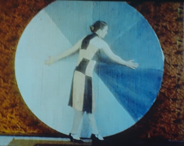 Colour, textiles, modernity and movement in early colour films
The second keynote of the conference, Ranjani Mazumber (Jawaharlal Nehru University), was the final speaker of the day. Her paper ‘Colour, Mobility and Cinematic Cartography: Exploring India in the 1960s’ was an illuminating talk on a very specific and somewhat neglected period of Indian film history in which India was courted by the Soviet Union. We learnt about the recurring motif of the jeep, which was utilised as a way to explore the country and thereby reveal the industrial modernisation of the nation. This ‘industrial sublime’ brought a ‘fantastical’ colour aesthetic to the Indian landscapes on screen, with man-made constructions vividly highlighted against blue skies in films such as Aadmi Aur Insaan(1969).
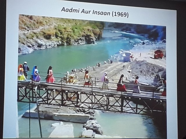 The ‘industrial sublime’ as showcased in the Indian colour film Aadmi Aur Insaan(1969)
The final day of the conference began with the panel ‘Colour Film Technologies in Asia’. The first paper by Zhaoyu Zhu (Kings College London) examined colour film making in Maoist China. He explained that the once popular water soluble film changed to oil soluble after the people’s revolution in the late 1960s. The first colour feature film in socialist China was Butterfly(1953), which was shot on Agfa film. Zhu noted that by 1976, 94% of films were produced in colour. Kirsty Sinclair Dootson’s (University of Cambridge) paper picked up on the Indian film theme of Ranjani Mazumber’s keynote. ‘Swadeshi Colour: Technicolor’s Indian Laboratory’ looked at the connections between colour on film and in textiles, an industry of great importance in India. Against the backdrop of the British Empire and imperialism the paper investigated Technicolor’s unsuccessful attempts, after Indian Independence, to establish a colour laboratory in the country.
 British empire, imperialism and Technicolor’s intervention into India
After a short break the very final panel of the conference was ‘Politics and Ideologies of Global Colour and the Film Archive’, which linked to some of the colonial issues highlighted in Dootson’s work. The first paper was ‘Amateur Private Views for Public Consumption: An(other) Johnny Gurkain Colour’ from Annamaria Motrescu-Mayes (University of Cambridge), who showed some fascinating amateur colour footage from the 1950s as part of her presentation. This was followed by Stephen McBurney (University of Glasgow) who focused on Up the Nile, the Way to Atbara(1899) a film of soldiers in the Sudan marching against a nondescript background. The film was coloured by Walker & Company of Aberdeen to engender patriotism through the extreme red of the soldier’s uniforms. The final two talks from Jan Faull (Royal Holloway, University of London) and Liz Watkins (University of Leeds) looked at colour film restoration. Jan Faull’s focus was on cinematographer John Noel, renowned for his pioneering camerawork on Everest expeditions in the 1920s. Liz Watkins looked at the issues associated with colourisation of original black and white images and in particular Peter Jackson’s film They Shall Not Grow Old(2018). The colourisation of which Jackson said provided the viewer with a ‘more immersive effect’. This led to some lively discussion regarding the intentions and reasons for colourisation techniques, particularly issues regarding the ethics around film restoration.
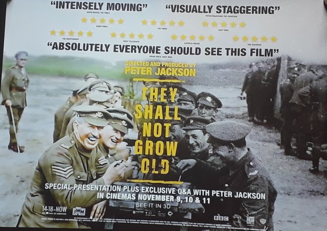 Issues of colourisation and film restoration discussed in relation to They Shall Not Grow Old(Peter Jackson, 2018)
After some closing remarks, three days of intensive colour focus were over and we spilled out into the enhanced colour of a sunny Bristol afternoon.Many thanks to ‘The Eastmancolor Revolution and British Cinema’ project team for organising a wonderful conference.
