
By Sarah Street
In Black Narcissus (Powell and Pressburger, 1947) Mr Dean (David Farrar) comments that at Mopu there is ‘something in the air that makes everything seem exaggerated’. The film was indeed noted for bringing out this quality, made possible through the ingenuity of production designer Alfred Junge, matte artist and special effects technician W. Percy Day, cinematographer Jack Cardiff and costume designer Hein Heckroth, in a film that despite its Himalayan setting was shot at Pinewood Studios and at Leonardslee sub-tropical gardens, West Sussex (Street, 2005). The release of a new screen interpretation of Black Narcissus (DNA Films, 2020) naturally invites comparison with Powell and Pressburger’s celebrated film, for which Jack Cardiff won an Academy Award for his Technicolor cinematography. Reviews of the 2020 TV mini-series have concentrated on its intended focus on Rumer Godden’s source novel (1939) by including, for example, characters such as Sister Adela (Gina McKee) who was omitted in the 1947 film, and the casting of ethnic actors for character roles such as Kanchi (Dipika Kunwar) and Angu Ayah (Nila Aalia) that were played by British actors in the film (Jean Simmons and May Hallatt). There has been far less commentary about how the mini-series is very much in visual dialogue with the film, demonstrating in some shots a very close approximation of similar colours, lighting and composition, in capturing the ‘exaggerated’ atmosphere that unsettles the nuns in their mission of establishing a school and dispensary in a palace at Mopu, a fictional location in the Himalayas. The palace was situated high up ‘on a ledge cut like a lip from the face of the hill and it seemed to be perpetually riding into the north’ (Godden, p. 21). The mission is led by Sister Clodagh who comes to rely on the local knowledge of the area and customs provided by Mr Dean, the Agent of General Toda Rai, who invited the nuns to reside in his palace. The narrative explores how Mopu affects the nuns in different ways, leading to a series of tumultuous events that eventually force them to leave.
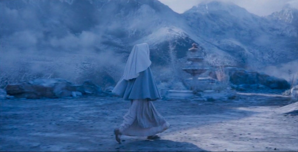
The 2020 version was also filmed at Pinewood, but location shooting in the district of Mustang in Nepal enabled director and cinematographer Charlotte Bruus Christensen to use the natural environment to best advantage, even though much of this is also shot as a homage to the 1947 film. These two opening shots show how the mini-series used the skyline as a feature, firmly establishing the key role played by the visually stunning locale that unsettles the nuns as they begin their work.


This post is intended as a visual essay on the correspondences and differences in terms of colour design between the 1947 film and 2020 mini-series. There are several very clear references that recall the film, while at the same time there are elements which invite comparison between the look of Technicolor and today’s digital capabilities. In a selection of themes which demonstrate this intertextuality, it is clear that both versions display a heightened appreciation of the power of colour to dramatize a narrative. While many of the effects created in 1947 have been celebrated, convincing many that the film was shot on location in the Himalayas (although Rumer Godden thought the film lacked authenticity), Bruus Christensen exploits colour effects now possible in shooting and in post-production. She knew the 1947 film well but wanted to ‘re-interpret’ the novel with ‘a 2020 mindset’. This involved working closely with actors in focusing on narrative and performance in order to establish the priorities of each scene’s visualization (CinePod, 103).
Set Design: The House of Women/St. Faith
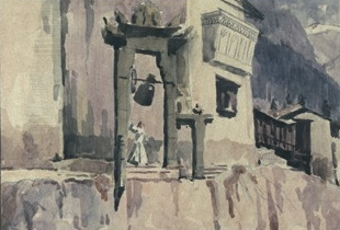
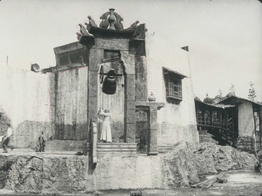
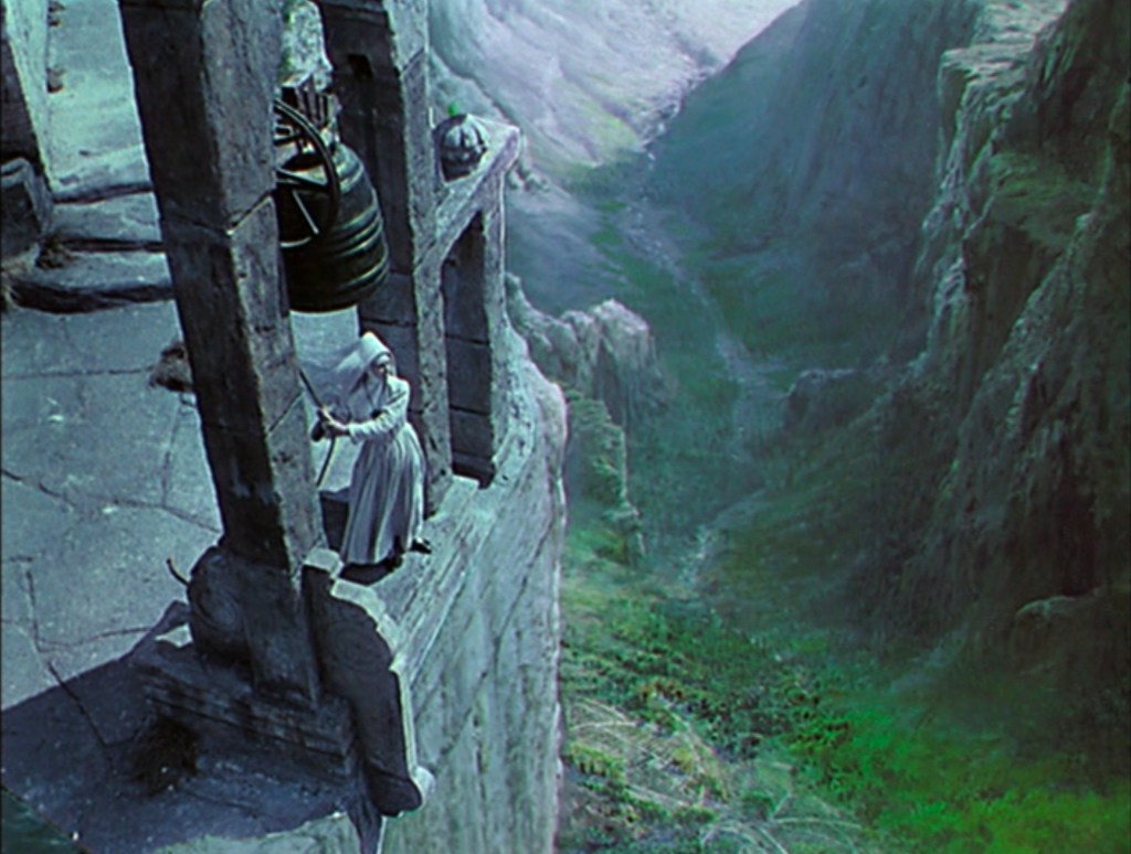
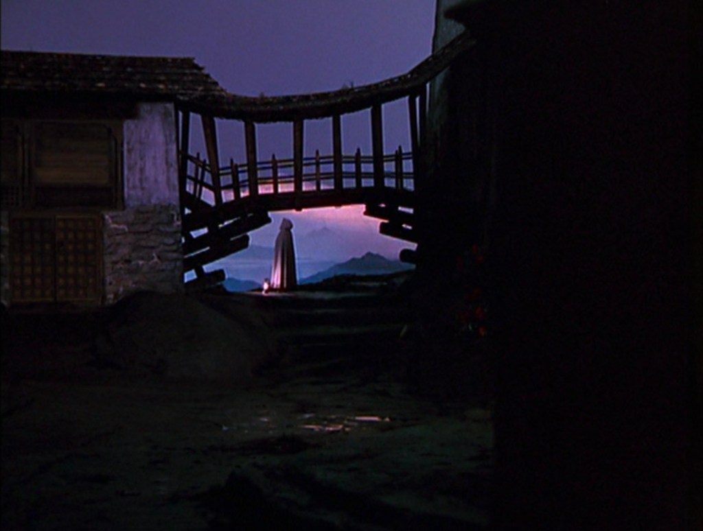
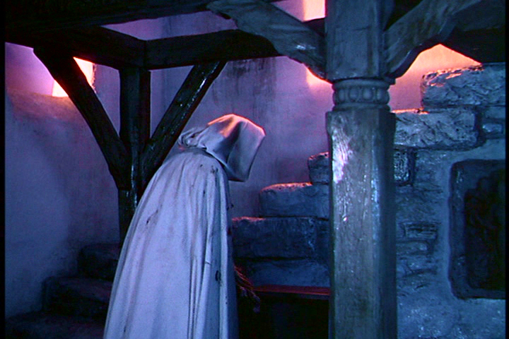
Alfred Junge’s designs for St. Faith created an iconic precedent that was clearly used as a template for the mini-series (Kave Quinn, production designer). The set built at Pinewood was only a few feet above the ground. Junge’s drawings and their realization in the film however create the impression that St. Faith is located high in the mountains, on a terrifying precipice. This is replicated in the mini-series, as we see in the following images.

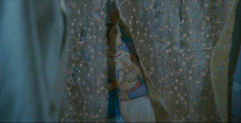
The palace the nuns occupy was a former harem known as ‘The House of Women’. Even though they re-name it ‘The Convent of St. Faith’ the surviving interior wall paintings show the women who lived there, and these function as a disturbing reminder to the nuns of their enduring influence; although physically absent they seem to haunt the building, affecting Sister Ruth (Aisling Franciosi) in particular in the 2020 mini-series. In both versions the wall paintings are key production design features, as seen below.
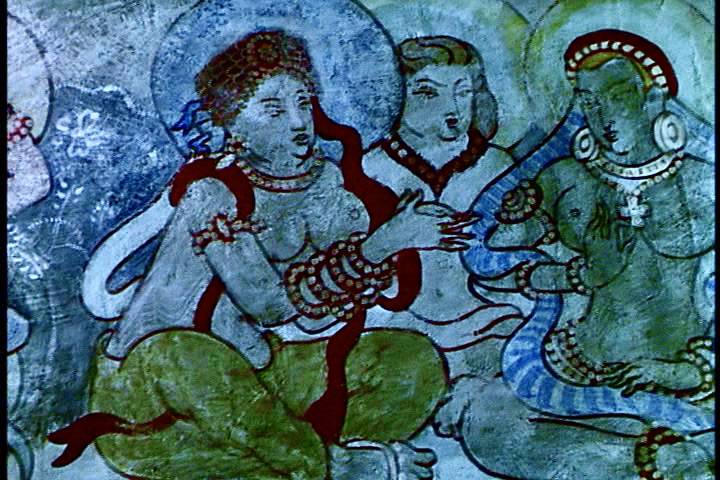

In the 2020 version the paintings are used to dramatize Sister Ruth’s disturbing thoughts as she grows increasingly unsettled by Mopu’s atmosphere. She glimpses the paintings that have been covered by drapes. As she passes them, she looks ahead and the colour red, with which her rebellion is so associated in the 1947 film, is used in a vivid point-of-view shot that communicates the House of Women’s enduring legacy. In Godden’s novel it is Sister Clodagh who senses the women from the past: ‘The house had its own people…She seemed to hear the door opened in the night, and hear them coming, running, gauze hurredly twisted round their bosoms, flowers seized and pinned in the hair, feet with anklets chiming, hastening to the door. She heard them come and she heard their voices, whispering as they gathered their finery, coming to the door to welcome Dilip Rai’ (p. 105). The mini-series thus takes a cue from the novel to communicate a sense of the past mingling with the present, an interpretation applied in this instance to dramatize Ruth’s increasing psychological disturbance.

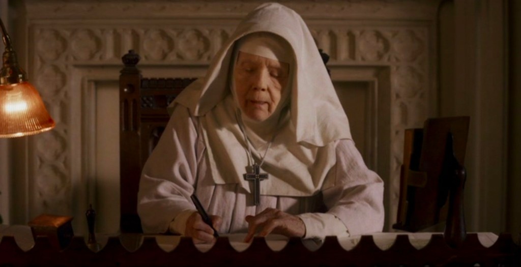
The mini-series also includes in the opening shots of the first episode some warm-accented frames that show the women who lived there. There is no equivalent in the 1947 film. These follow some colder, blue-accented shots that are used throughout as a contrast to earthier tones associated with interiors and in scenes such as when Mother Dorothea (Diana Rigg) writes to Clodagh from the safety of the Mother House. We see Clodagh (Gemma Arterton) reading the letter in much cooler tones which reflect Mopu’s very different atmosphere. This emphasis picks up the novel’s description of the site of the palace as ‘full of wind’ and very cold, even to the extent that the icy wind penetrated through the floorboards (p. 21).

Expresssivity and coloured light
Jack Cardiff used a non-naturalistic, expressive palette for Black Narcissus, created by chiaroscuro lighting, fog and colour filters, and diffusing techniques. These are most evident in the ‘stalking’ sequence towards the end of the film when Sister Ruth (Kathleen Byron) watches Sister Clodagh (Deborah Kerr) from afar. Pink/mauve and grey tones are highlighted, and we can see that this palette has also been applied in the mini-series. Red/pink light shines through windows, most strikingly in the chapel, and is also heightened in the climactic scene when Ruth struggles with Clodagh at the bell tower.


Remembering Sister Ruth?
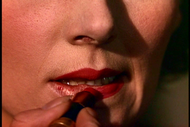
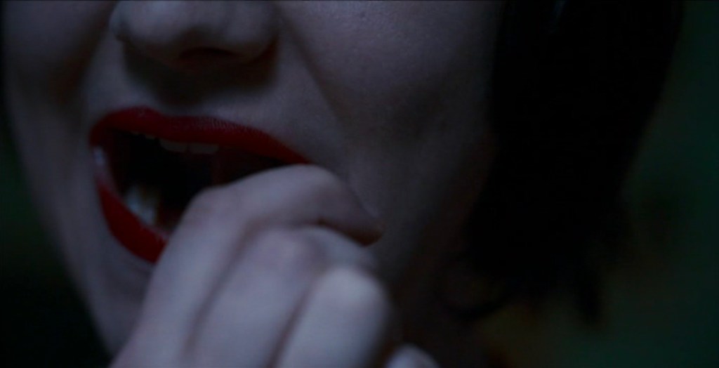
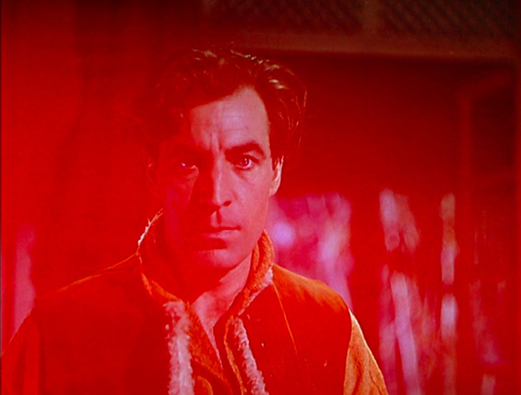
Kathleen Byron’s performance as Ruth remains one of the film’s most compelling elements. Replicating its power to shock in 1947 would have been difficult, and in this respect the mini-series is unable to deliver this most celebrated feature. The sequence in which Ruth confronts Clodagh, applying red lipstick to symbolize her rebellion, is not repeated in the mini-series. Instead, Ruth applies the lipstick in darker light, and she is on her own. Rather than wearing a red dress that made Ruth’s transformation so striking in the film, in the mini-series Ruth swaps her nun’s habit for a pink garment found in a trunk. A feature is not really made of it: it is simply the case that she used what she could find to look completely different, even a little ridiculous when she goes to see Mr Dean in his cabin. In Powell and Pressburger’s film this scene uses a red-suffused screen to dramatize Ruth’s anger at Mr Dean’s mention of Clodagh, and her brief physical collapse. This most striking effect conveys the extremity of her psychological disturbance. Hitchcock later used a similar effect in Marnie (Belton 2013: 191). Although the mini-series chooses not to use colour so dramatically for this particular scene, on other occasions, such as a long shot of the struggle at the bell tower, taken from an apparently aerial constructed perspective, it develops an expressionistic connection between action and the natural environment as dawn is breaking.

Screenwriter Amanda Coe stated that her adaptation of Black Narcissus was very much grounded in Godden’s novel as ‘part ghost story, part romance, it’s full of atmospheric detail about the landscape and its people, as well as psychological acuity about the failures of understanding, both cultural and personal, that lead to tragedy’. She aimed to ‘bring the story to life for a new audience’, and towards this end we can observe differences in approach from the 1947 film in respect of dialogue, ethnic characters and the more seemingly adolescent perspective on Ruth (2020/21: 18). But as far as colour is concerned, both versions share many features that confirm the compelling, ‘exaggerated’ visual legacy of Technicolor in Black Narcissus as inspiration for today’s digital technologies.
References
Belton, John, ‘Color and Meaning in Marnie’, in Color and the Moving Image: History, Theory, Aesthetics, Archive, eds. Brown, Simon, Street, Sarah and Watkins, Liz, New York: Routledge, 2013: 189-95.
Coe, Amanda, ‘Sisters of Desire’, Radio Times, 19 Dec 2020 – 1 Jan 2021, p. 18.
CinePod – The Cinematography Podcast, 103: Charlotte Bruus Christensen, 2 Dec 2020.
Godden, Rumer, Black Narcissus, first published 1939, Pan Books edition, 1994.
Street, Sarah, Black Narcissus, London: I. B. Tauris, 2005.
