
To mark the publication of Colour Films in Britain: The Eastmancolor Revolution (BFI/Bloomsbury, 2021), the book co-authored by Sarah Street, Keith M. Johnston, Paul Frith and Carolyn Rickards, was launched at event chaired by Liz Watkins (University of Leeds) and hosted online by the University of East Anglia on 16th December. At the launch, three of the book’s co-authors each selected an image from the book’s grand total of 154 colour images, and gave short presentations before responding to questions from attendees. The choices were very hard to make, but we came up with three images which we hope you’ll enjoy reading about here as a taster for the book which marks the culmination of our AHRC-funded research project that ran from 2016-19.
Sarah chose an image from Peeping Tom (Michael Powell, 1960), and she writes about why she chose this particular shot from a film with a controversial reputation.

This image is featured in our chapter on institutions, in the context of the British Board of Film Censors’ attitude towards colour films. This was generally anxious because it was thought, as described by John Trevelyan, Secretary to the BBFC 1958-71, to emphasize and increase the ‘potentially dangerous…sadistic and nasty’ elements in horror films. Peeping Tom was unashamedly filmed in Eastmancolor, and Michael Powell drew on his past experience of filming in Technicolor, a factor that Trevelyan took into consideration when making considerable efforts to ensure that Peeping Tom wasn’t banned. Seven cuts were made to the film and it was classified ‘X’ by the censors. As Trevelyan’s testimony later revealed, they ‘hoped for the best’, but this was no preparation for how the film would turn out with its effective central performances, psychological exploration of Mark’s disturbed childhood, and the film’s deliberate avoidance of crude, ‘tomato ketchup’ effects. The horror of Peeping Tom is in the unseen, horrific idea of the way the women are murdered by the photographer Mark (Carl Boehm) with his spiked tripod, filming them as they see their own distorted, mirrored reflection as they die. Nor had the censors anticipated Peeping Tom’s punishing critical reception – Caroline Lejeune in the Observer, for example, saying: ‘It’s a long time since a film disgusted me as much as Peeping Tom’ – that more or less put Michael Powell out of work for many years.
While the censors didn’t mention colour explicitly in the case of Peeping Tom, it’s used to graphically present the world of the film and is integral to the design. So, as well as relating to the theme of censorship, the shot I’ve chosen highlights the function of colour more generally in a film that uses it in very particular ways. Rather than simply enhancing the most horrific scenes, colour functions as complex schemes of interrelated, chromatic patterning that are part of the film’s world while at the same time using techniques that permit us to maintain critical distance at key points. Red is emphasised by its strategic appearance, which sets up associative connections and resonances throughout the rest of Peeping Tom.
Artificial colours are particularly used to help depict the contemporary setting, the ‘adult’ milieu of Soho within which the idea of horror is suggested. Artificial lighting features in Mark’s photographic studio, and also in one of the key murder scenes that takes place in a film studio where Mark works part-time as a focus puller. The shot I’ve chosen occurs when Helen (Anna Massey) visits his rooms in the house he owns and in which she is a lodger. It’s Helen’s 21st birthday. She’s having a party and takes some cake up to Mark’s rooms, so he doesn’t miss out. He invites her in, and she discovers that he has a dark room where he processes his home movies, and a collection of photography equipment. He tells her he’s a photographer, hoping to be a film director. She then asks to see his films – ‘a birthday present from you to me’. He shows her his father’s creepy home movies, including when the young Mark is filmed looking terrified, and when he says goodbye to his mother soon after she’s died and is laid out on a bed. As Mark tells Helen about this, he puts his hand gently on her shoulder, before showing her more of the films that show his mother’s funeral, and then a woman referred to as his mother’s ‘replacement’, and we see Mark’s father giving him a gift of a camera, the same one he keeps in his studio and uses for his own home movies which also attempt to capture the fear on his victim’s faces.
The shot here comes towards the end of the home movies from Mark’s childhood, and as these become gradually more disturbing Helen says sharply: ‘Switch it off Mark, switch it off!’ The dark room’s vivid, artificial red contrasts with the home movies which, like Mark’s, were shot in black and white. But Helen is unable to view them from the perspective of a distant observer, or as an interesting documentary experiment. The fact that for the cinema audience colour is used to depict the ‘real’ world of the murders, as opposed to Mark’s black and white recordings of them, and in Helen’s ‘seeing red’ reaction to his father’s experiments, marks a key difference between their viewing practices. While Mark is seduced by the clinical spirit of experimentation that for him indicates the success of his own black and white home movies, Helen’s angry reaction to his father’s films challenges any notion of exoneration implied by those conventions. The red darkroom’s function of developing private films can also be linked in this context to the colour’s cultural associations with sexuality and violence. The contrast between monochrome and colour accentuates colour’s function and capacity to problematize conventions of photographic realism.
But for me the shot also has an appeal as capturing a look of intimacy, almost a close-up into Helen’s soul which through her expression at this moment is tinged with both intrigue and trepidation. This gradually seeps in because Mark’s abuse as a child seems to have contributed to his crimes, particularly their method. The screen is bathed in red, and this is redolent of experimental techniques in which the vivid sensation of enveloping, ‘total’ colour can be a striking, expressionist effect. This is expanded cinema in the broadest sense, a window into a person and world that is dangerous. Artificial red light accentuates the sense of a loss of control, as if its vividness is connoting the seeping, saturated impact of Mark’s horrific pastime which also involves blinding his victims with light. A private moment is a private space, connoting intimate thoughts. The colour red here is caught between passion and anger, accentuating the surface colour’s multivalence and subterfuge. It accentuates colour’s capacity for double meanings, and, in this case, acquires sinister connotations. Sequences such as these undoubtedly contribute towards the film’s pervading atmosphere of tension. They also expose the BBFC’s fixation on blood, or the length and number of particular shots, as a profoundly limited understanding of how a film, and its colours, can skilfully build up both tension and horror.
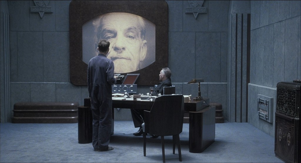
Keith’s chosen image was from 1984 (Michael Radford, 1984), the film adaptation of George Orwell’s 1984, that sits at the later end of the period covered in our book. At the launch he explained why this image is so interesting as a way into talking about Eastmancolor, cinematography and the film laboratory.
In 1961, R. Howard Cricks noted that ‘the contribution of the film laboratory to the production of a film goes largely unrecognised’. With colour film processing so central to the Eastmancolor Revolution we cover it in several chapters of the book. It’s possible to see the introduction of Eastmancolor to British cinema as a democratisation of colour film production and processing – breaking Technicolor’s colour processing monopoly and allowing Eastmancolor to be processed by labs such as Denham, Humphries and Kays. In the process, this created lucrative opportunities through processing rushes, final prints, optical processing, and the production of release prints for distribution. The laboratories were aware of the financial possibilities that Eastmancolor created – Humphries invested in a new building extension with three floors devoted to printing and processing Eastmancolor, while Denham converted many of their machines to colour. In 1956, Cricks claimed that the quick expansion of British colour processing in the 1950s maintained ‘Britain’s reputation as the laboratory of the world.’ Indeed, UK labs processed colour film for different film industries – often ensuring continuity of rushes and processing for American productions filming on location – the 1957 MGM-British film The Little Hut saw raw film stock flown from London to Jamaica, with the exposed stock flown back to Denham which produced the rushes, before sending them to the film’s production base in Rome.
The relationship between cinematographer and laboratory was key when a particular look was required of the colour stock – with colour graders and lab technicians often called upon to deliver precise stylistic requirements. Colin Flight talks about production companies seeing the laboratory as ‘the black box… the unknown’ element of film production – while Chris Menges described the close relationship between cinematographer and colour grader as ‘incredibly important, as important as dealing with the art department or the costume department’. However, the use of different laboratories could produce difficulties in ensuring the quality of colour reproduction. Peter Suschitzky talked to us in 2018 about the issue of shooting a film in Eastmancolor which was then processed by Technicolor – as he says this meant ‘one would see the rushes one way and then the film looked different’. One of the curiosities we found when looking at the introduction of Eastmancolor was that from the 1950s on, cinematographers and directors were looking to the stock to offer a more realistic colour palette than the more striking colours expected from Technicolor – some of those techniques were developed on set while others relied upon the laboratory.
When Columbia Pictures told director Sidney Lumet and cinematographer Freddie Young that they couldn’t shoot their UK-US co-production A Deadly Affair in black-and-white, Lumet insisted that the colour needed to be desaturated to capture the ‘dreary, lifeless feeling London has in winter’. Young suggested pre-exposing the film to reduce the colour properties of the stock. Similarly, cinematographer Brian Probyn used talcum powder to try and soften the light on the set of Poor Cow – while Chris Menges (who had worked on Poor Cow) chose to pre-flash the negative on Kes to reduce the impact of the colour – again, because Menges and Ken Loach were not allowed to make the film in black-and-white. For Menges, pre-flashing the negative – a risky move as it was an irreversible approach – was worth the risk because it produced a better exposure in low light conditions and offered a more subdued and naturalistic colour palette. There was a broad concern about pre-exposing – or pre-flashing – within the industry, due to the potential danger to the negative. Cinematographer Edward Lipnick noted in 1973 that ‘exposing your negative to varying amounts of light… without being precisely certain what the results are going to look like… [was not] a technique designed to reduce the anxiety level of a cameraman shooting a major feature’.
Turning back to 1984, I want to explore a technique called bleach bypass, which was developed through a relationship between cinematographer Roger Deakins and the team at Kay’s Laboratory, led by laboratory technical manager Paul Collard. Like the other approaches discussed above, bleach bypass is a system where colour film stock can be desaturated, pulling back from the full colour image to something which offers a more muted palette. Virgin Films would not allow 1984 to be shot in black-and-white. Looking for an alternative, Deakins remembered a 1960s process called silver tint that had been used by Japanese cinematographer Kazuo Miyagawa – but no records existed to show how it was done. During pre-production discussions at Twickenham film studios, Kay’s Laboratories contact man John Hemmings consulted the technical team at Kay’s. As Paul Collard told us in 2017, Hemmings said ‘there’s this line in the book “everything was without colour except the television screens which shone forth with a bright yellow light”… “that’s what they want”… he just said “can you go away and do that?”’ Collard, who had worked at Kodak before becoming Kay’s technical manager, then worked in partnership with Deakins to develop a system that would offer a partial black-and-white colour aesthetic, but without pre-flashing or pre-exposing the negative.
Collard describes the process that led him to the new system:
‘I thought… there’s no way I’m going to do this on the negative… so I discarded that but the print… well, we actually remove the silver in the bleaches, so why don’t I try… not using the bleach and see what happens… It came out very heavy, because you’ve now got like a double image there. So, we then said, okay lets’ play around with this’.
Deakins recalls spending ‘weeks doing tests at the lab’ before finding the final process, where the Kays team took ‘the bleach bath away from making the print and exposing it fifty per cent what they would normally… it’s a different effect when you do it on the print. It’s really striking how black the black is… it almost shines’ (Criterion 2019). However, the new process increased the pressure on Kay’s staff because once it was approved by the producer and director the laboratory had to make all the rush prints and the release prints using a time-consuming method. The system also put pressure on the film’s budget, due to all the dailies being printed using the bleach bypass process.
1984 clearly adjusts its colour palette across the narrative, demonstrating the range and potential of the bleach bypass system. The opening scenes show a crowd at a ‘two minute hate’ – and the large television screen does indeed cast its ‘bright yellow light’ over them, illuminating individual faces in the crowd, who are otherwise nondescript in blue and black clothes, fading in to the darkness. The dominant tones of blue, grey and sepia established in this opening sequence resonate through the film, offering a sense of the faded, worn, and almost colourless world that Winston Smith (played by John Hurt) lives in. There is a brief contrast with natural green tones in the brief rural idyll that Julia (played by Suzanna Hamilton) and Winston share – but this is a momentary respite at both narrative and chromatic levels. The film’s final scenes use colour to underline the cyclical and unending nature of its narrative, reverting to its dominant faded blue-grey colour scheme as Winston and Julia return to their lives.
Although Kay’s were unable to make bleach bypass into a proprietary system, it did become industry standard for filmmakers. Terence Davies used it in Distant Voices, Still Lives (1988) and The Long Day Closes (1992), Mike Leigh used it on Naked (1992), and Roger Deakins utilised the process in later films such as Jarhead. It is a mark of its success that, as Paul Collard notes, it has been ‘adopted electronically… electronic [grading] machines… have a bleach bypass button on them’.
If laboratories were the black box of the film industry – and given the practical, photochemical, industrial and economic difficulties that lay between exposing a film negative and producing the final release print – they reveal a gap in how we understand film history. In our work, it’s clear that laboratory workers played a crucial role fuelling and supporting the Eastmancolor revolution – and I hope our book usefully highlights and celebrates that work, and perhaps encourages more research on that area in the future.
Paul chose a pair of images that relate to questions of Eastmancolor fading which is sometimes incorrectly referred to as magenta fading, for reasons which are apparent when you look at the image on the left here. The examples shown here are taken from a 1955 short film, A Man on the Beach, directed by Joseph Losey: on the left, a still from an original anamorphic print; and on the right, an image from the same sequence, taken from the 2009 BFI restoration, which returns the colour to something more like its original appearance.


This magenta bias is actually the result of Cyan and Yellow dyes in the print stock naturally fading over time, leaving behind a reddish brown look to the remaining image. While it might be tempting to look at faded images such as these and blame the results on improper storage conditions, faulty processing at the lab, or an issue with the original Kodak stock, in reality, the short-life span of dyes in the Eastmancolor print stock was neither a secret nor necessarily even considered to be a problem until many years after its introduction. Given that the average theatrical run in cinemas was no more than several weeks, there was no financial benefit to having prints which lasted beyond this point. Though filmmakers had the option of creating black-and-white preservation masters, this came at too high a price for a product with no perceived long-term value.
It wasn’t until the late-1970s, when the value of archive material, particularly for the lucrative television and home video market, was fully realised, and that faded Eastmancolor stock would be recognised as a significant problem. The issue came to prominence in the late-1970s when Martin Scorsese led a campaign to introduce more reliable film elements, to ensure that the colour aesthetics survived beyond the original theatrical run. At this point, many of the colour films in the archives printed on Eastmancolor stock succumbed to levels of fading similar to the example of Man on the Beach. These faded prints stood in stark contrast to those created using the dye transfer process at Technicolor which were available until the Technicolor labs in the US and Europe were closed in the 1970s. Because the Technicolor imbibition process applied dyes directly to the film strip, they were far more stable than the photochemical techniques used in the Eastmancolor printing process. While good quality Technicolor prints even older than those printed on Eastmancolor can still be found in the archives, many Eastmancolor prints made before the 1980s have succumbed to this irreversible fading – losing an important record of how the film was originally printed for theatrical release.
For the Eastmancolor project, this raised a series of important questions regarding colour aesthetics – particularly in relation to authenticity of the film image. Authenticity, and the notion of originality, has often been a key selling point for profit-driven high-profile restorations, particularly since the adoption of hi-def digital projection and home cinema. These restoration projects require a significant knowledge of historical film stocks and printing techniques, coupled with some educated guess work, in order to obtain an image as close to the filmmaker’s original vision as possible. However, the majority of archivists from national and regional archives we spoke to during the project, also recognise how these digital-born works should be regarded as a new interpretation of the film – neither replicating nor replacing the original theatrical release. In this sense, each restoration should be seen as just one interpretation in a long line of alternative versions of the original image – starting with colour grading and printing of the camera negative in the labs during the original production.
Through interviews we conducted with cinematographers Peter Suschitzky and Chris Menges, and key lab workers including Colin Flight and Paul Collard, what appears is a constantly shifting chromatic legacy, beginning at the moment the film enters the lab for grading and printing, and continuing across the subsequent re-issues and restorations. Colin Flight, who worked at Rank Film Laboratories, recalls how, working alongside the colour graders in the lab, cinematographers were able to impose their artistic stamp on the image before the mass-print-runs which would then be shown on the big screen for paying audiences. However, even during the subsequent printing stages, the potential for variations in that final image were endless. Deals were struck between the producers and various film labs in Britain and across the globe who were responsible for creating prints for the international markets. For example, while a film shot on Eastmancolor negative might be printed using the Technicolor dye-transfer process in Britain, elsewhere in the world, the same film could be printed on Eastmancolor stock. For cinematographers such as Peter Suschitzky, this became a bone of contention as the two print processes often produced differing aesthetics when screened in theatres; on occasion, Suschitzky looked unfavourably upon films he shot and graded on Eastmancolor which were later exhibited on Technicolor dye-transfer prints.
Considerations such as these highlight the numerous variables when approaching restoration projects. In recent years there has been a tendency to work with key personnel involved in the original production – typically the director or the cinematographer. However, this is not always the case, and in those instances where the expertise of the original filmmakers have been sought, this has sometimes extended beyond countering the effects of fading and other forms of damage to the film. For example, whilst working on the restoration of The Long Good Friday, cinematographer Phil Meyheux was able to remedy the effects of a Sarahan dust cloud which hung over the Thames on the day of filming, causing the scene to look much darker than elsewhere in the film. Though this provided Meyheux with an opportunity to address a problem caused on the day of filming, it also resulted in the creation of an entirely new aesthetic to the restored blu-ray release. On the otherhand, Peter Suschitzy and Chris Menges recall how on several occasions, films they shot were restored without their involvement. Perhaps the most significant of these was the re-issue of The Empire Strikes Back, on which Suschitzky and Menges both worked as cinematographers, but neither played any part the DVD or Blu-Ray re-issues, although, as Suschitzky suggests, the contrast in the final image was increased enormously during the process.
A key point argued within the project book, then, is the necessity to consider the production and release history of any film when looking at aesthetic, industrial or intermedial elements. With colour being so susceptible to the slightest change in photochemical or digital grading techniques, it becomes necessary to consider the issue of authenticity and originality in any discussion of colour and aesthetics. In what we term the ‘continuous spectrum of representation’, no version can be seen as ‘definitive’ nor should be taken in isolation from those which preceded it. For researchers working in this field, acknowledging these issues will help to further our understanding of the complex nature of engaging with archival material in its various forms.
Thanks to everyone who attended our launch event and we hope you enjoy reading the book which can be purchased following this link: https://www.bloomsbury.com/uk/colour-films-in-britain-9781911239574/
Finally, we thank the BFI/Bloomsbury for supporting us throughout the editorial process of completing the book and to all our collaborators in the project.
